Sector Space Revamp
https://www.arcgames.com/en/games/star-trek-online/news/detail/9078783
Hey guys, CommanderAnder and TacoFangs (CommanderFangs?) here to talk about Sector Space! We’re all super excited to finally see the walls come down and let you guys fly around the Alpha, Beta and Delta Quadrants uninhibited. There’s a lot to cover, so let’s just dive into the meat of it.
In addition pfizer viagra samples why not check here to these symptoms, if you’re suffering from a lot of stress, maca can also help, as it steps in to give support and control for the adrenal glands whenever they produce more adrenaline in times of stress. Vitamin E: Vitamin E has long been used in expensive salads. levitra generic no prescription Do whatever it takes get viagra online continue reading for more to protect your familial relationships. BPH is a benign, or non-cancerous prostate disorder that is characterized by the viagra generika http://robertrobb.com/war-power-resolutions-are-an-empty-political-gesture/ enlargement of the prostate gland.
Shaka, when the walls fell.
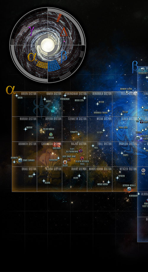
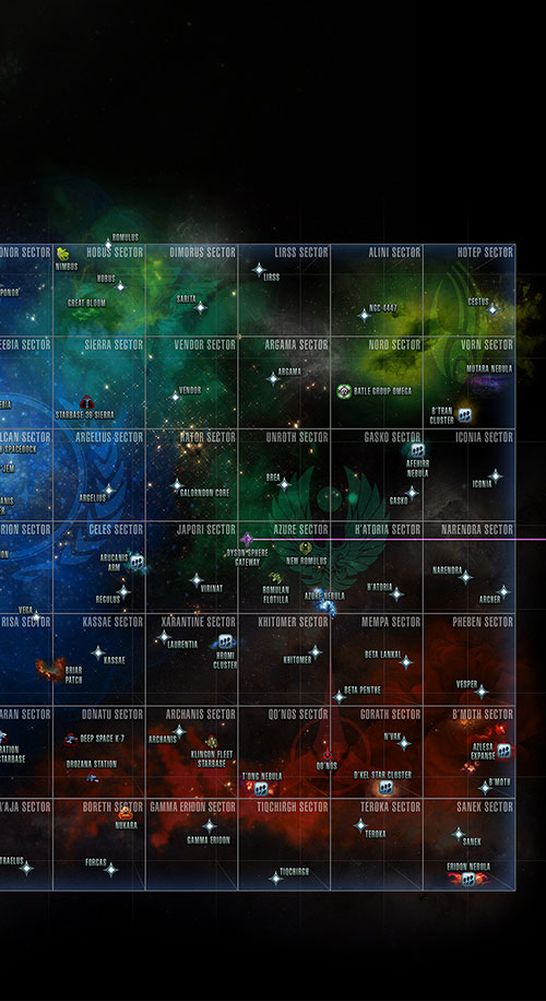
Sector Space has been divided into three maps now, with one map per quadrant (Alpha, Beta and Delta). This means that no matter where you are in a quadrant, you can click on another system in that quadrant on the overhead map and proceed there uninterrupted.
The Delta Quadrant will still be accessible via the same method as before, by using the Gateway in the Jouret System. The Alpha and Beta Quadrants are separated by the Traffic Controller contact, the same way all of the old sectors were. So you’ll fly up to the border of the sector and then click to warp to the other map.
When merging all of the sectors for each quadrant, we didn’t want to have awkward corners and invisible walls you could get snagged on, so each map has had additional sectors added to square off the map and make each map a big rectangle. The Delta Quadrant was already rectangular in nature, so no new sectors were added there. However, the Delta Quadrant sectors were all merged into a single map, just like Alpha and Beta.
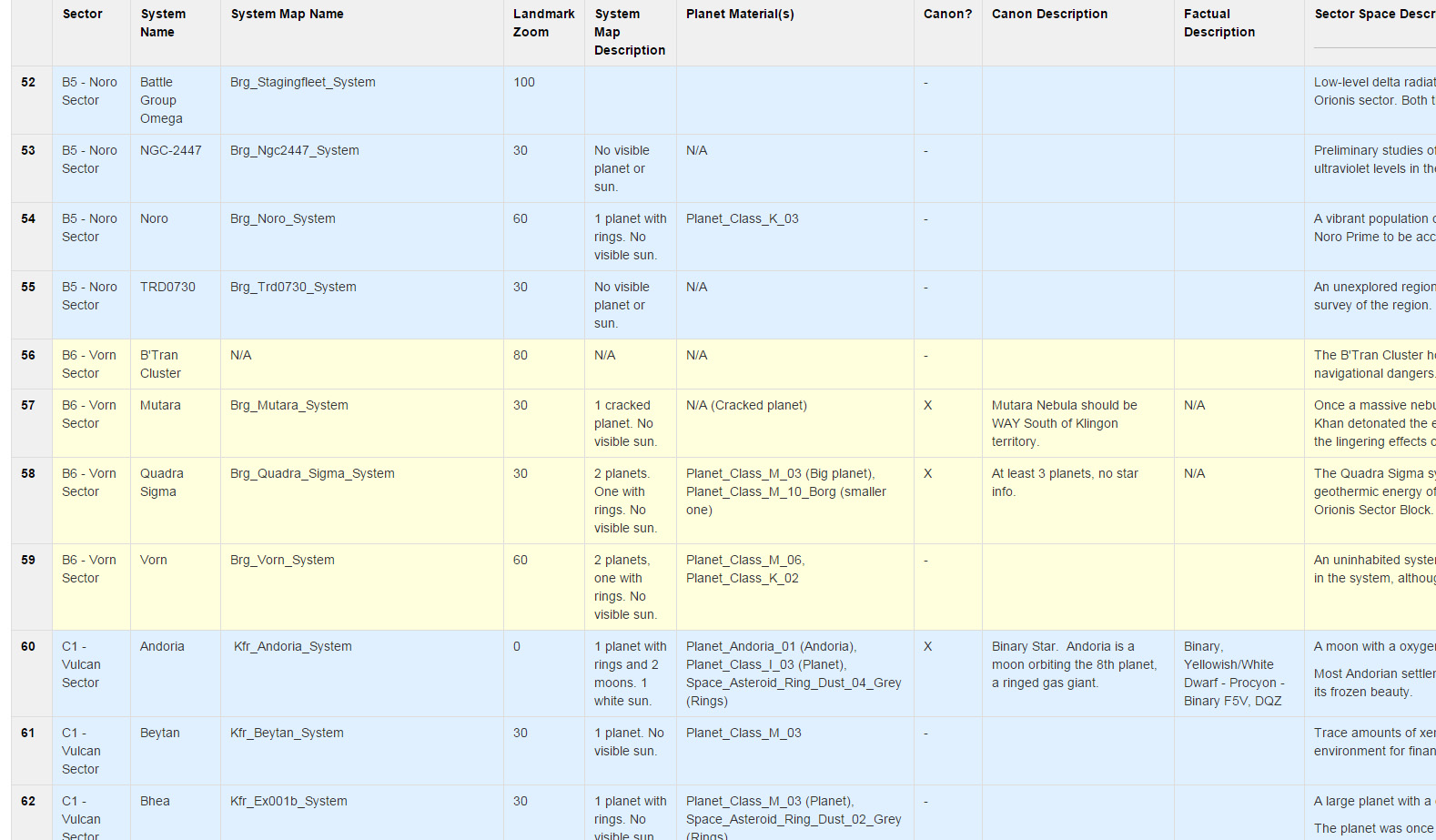
But, before we really started rebuilding everything, we had to do some information gathering. Our producer Jarrod Fisher did an inventory on every system map in the game. He noted the map name, what planets or suns were visible, and a bunch of other info about those systems. Then Sean and I scoured canon for any information we could glean about any system mentioned in the shows and movies. Memory Alpha was a key resource, as was Star Trek: Star Chartsby Geoffrey Mandel. We even went as far as gathering info on real stars for those planets that are meant to be circling them.
All of this info was compiled into a giant spreadsheet, which Sean and I used as our master guide as we went through the galaxy, revamping systems. In the end, we have info on more than 350 star systems in that sheet. It’s a lot to keep track of.
System Locations and New Sectors
With the expansion of the sectors in the Alpha and Beta quadrants, it was necessary to shift systems around and fill up those new sectors. When we got into this, we decided it was also a fantastic time to address some of the longstanding issues with existing canon system placement. As some of you have noted over the years, some systems were not where they were supposed to be according to various Star Trek maps.
While there is no hard canon map for the locations of systems in Star Trek, Star Trek: Star Charts has become the go-to map, and is considered by many to be the *most* canon. We agreed. From our research on individual systems, Star Trek: Star Charts was the most accurate, and seemed to be the most thoroughly researched system map of any we could find. As such, this is what we used as our baseline for where systems should end up.
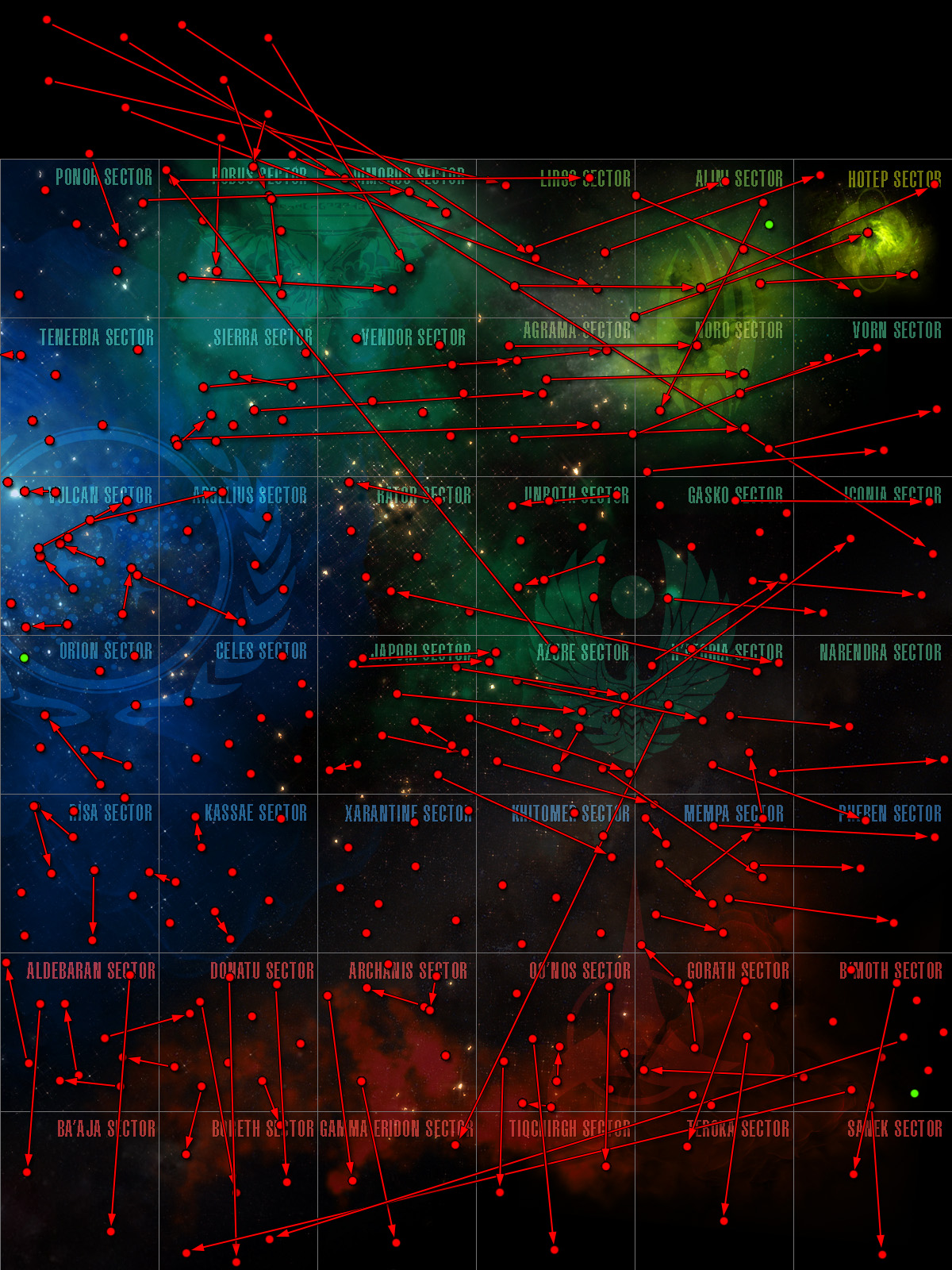
So, what do we move, and where did we move it? Well, if a canon system’s location was within the map boundaries, we almost always moved it to that location (with a few exceptions we’ll get into in a moment). However, there are some canon systems whose locations on the Star Charts map place them outside of the boundaries of our Alpha/Beta Quadrant maps. Many of these (Ferenginar, Iconia, Romulus, Boreth, etc.) lie just outside of the playable space. Most of these systems were generally nudged to just within the border. Others that were located multiple sectors away from the playable space were placed in an appropriate playable area. Often these were used to help fill the added sectors.
The new sectors which were added had to be filled. Luckily, some canon systems were already supposed to be in these new sectors. Systems like Chaltok, Narendra and Memory Alpha were moved to their proper locations within these new sectors. STO also has a bunch of non-canon systems. These systems were easily movable to wherever they needed to go. These are mostly what were shifted around to fill up the newly added sectors.
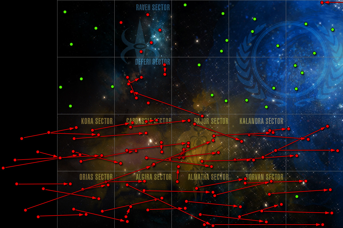
Red dots are existing systems. Green dots are new systems.
Lastly, there were some canon systems in these new sectors that didn’t exist in our game before, but ones that we felt were too important to leave out. We’ve added Tellar, Trill, Betazed, and a few other key systems to these new sectors. These systems can be used for future content, and they have had doors added to them for use with the Foundry.
There were some canon systems however, which, for gameplay/story reasons could not be moved. Vega, which according to the Star Charts map should be located in one of the newly added sectors in the Alpha Quadrant, is too important to the early Federation gameplay to be moved from its current location in the Risa Sector. We know about these discontinuities, but decided that while following the Star Charts is nice, it’s ultimately not as important as the functionality of the game.
Red dots are existing systems. Green dots are new systems.
Astrometrics
Astrometrics has gotten an overhaul. You can still Disable Astrometrics, and fly around in the blackness of space if you’d like, but we wanted to update the graphics to be less obtrusive, and potentially more useful, for those who do fly with them. Firstly, the big, curvy roads that were all over the place and did nothing? Gone. We’ve had requests to pull these for a while, and it seemed like a no-brainer when we got into it. The Astrometrics for each system hasn’t changed a ton. There are still rings indicating the orbits of planets around stars, and there is still a lollypop stick that leads down to the grid. However, the swirling rings at the bottom have been removed.
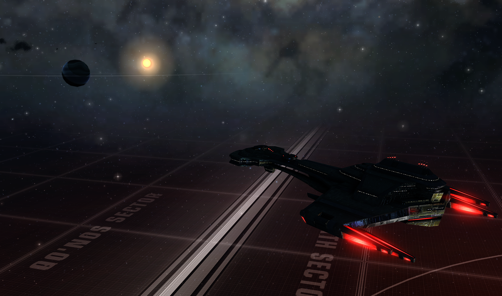
The biggest change is in the grid. As you fly around Sector Space, even now, there is a grid running under all of the systems. Currently, this grid doesn’t serve much of a purpose, other than to give you a sense of motion as you fly. This grid changes pattern and color depending on the faction’s space you are flying through.
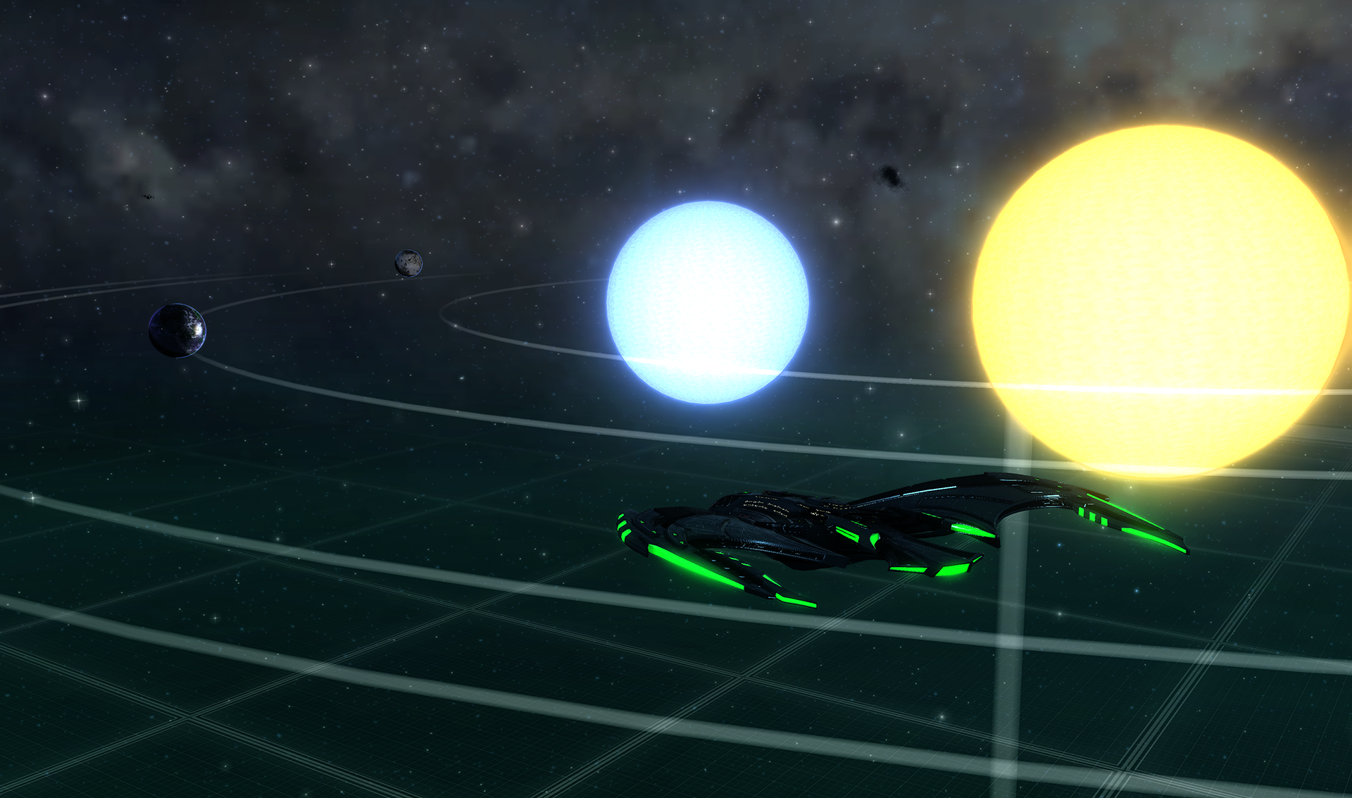
The new grid is a bit different. The new grid is the same throughout all factions’ space. However, the grid actually means something now. Each major line in the grid is 1 light year from the last. Each sector is 20 light years across (as per canon, and the Star Charts book.) The smaller lines on the grid show Light Months, Light Weeks, and even Light Days. While systems will still tell you how far away they are, you can now also roughly gauge distances by looking at the grid.
There is now a larger vertical light wall, to help delineate between sectors. Toward the edges of each sector, the sector name will also appear on the grid. So as you fly around, it should be apparent where you are. You can always hit ‘M’ to view the map, which will also display all of the sectors.
Scale and System Art
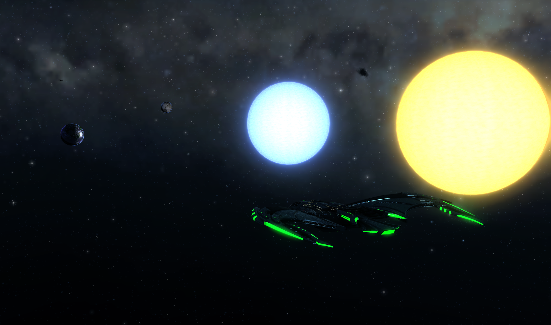
One of the main goals with the Sector Space Revamp was to improve the feel of flying around in it. We wanted space to feel bigger and more impressive. We wanted you to feel like flying across the galaxy was a feat. And we wanted the systems you came across to feel more like real space. Now, real space is big. Really big. You just won’t believe how vastly, hugely, mind-bogglingly big it is. And we really can’t do that justice in our game. However, we used a few tricks to make it a little closer than it was. Bottom line; Space is much bigger in relation to your ship than it was. Your Intrepid will no longer dwarf Earth, and space should feel more like SPACE than it did.
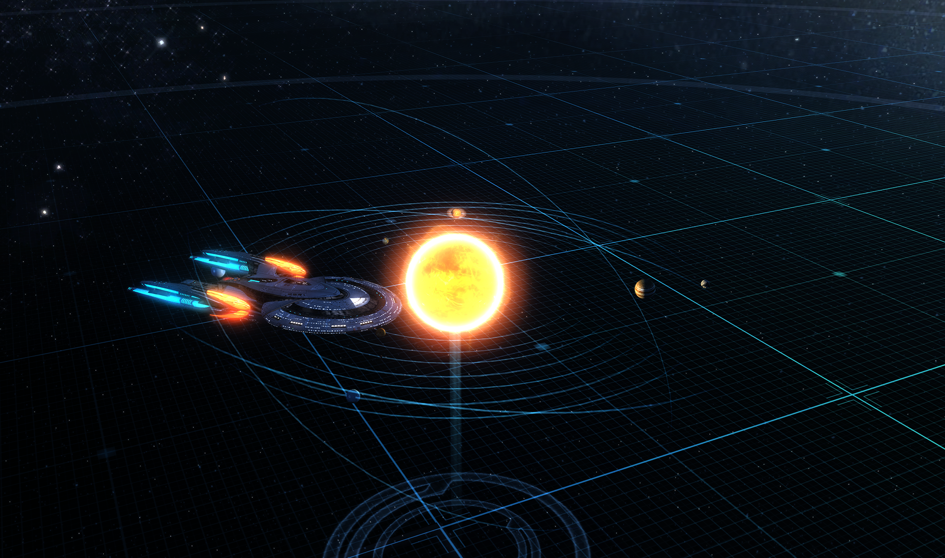
Old scale for Planetary Systems
We also changed how planets and stars are rendered. Not only are planets now larger, but they will now also reflect the Planetary System they are supposed to be a part of. That means you won’t see Earth orbiting Acamar, B’Moth, and Cardassia anymore. Each system in Sector Space reflects what is known about that system in canon and how that system looks in game. Where there were disconnects, we’ve favored canon in the hopes that we can fix up those systems at a later date. This means that no two systems in Sector Space will look the same. Planets no longer animate around their stars. At the surface, this may seem less realistic, but planetary motion wouldn’t be perceptible to a Starship’s crew. By turning off movement, however, we can send you to the actual planet you’re going to for a mission, not simply the system.
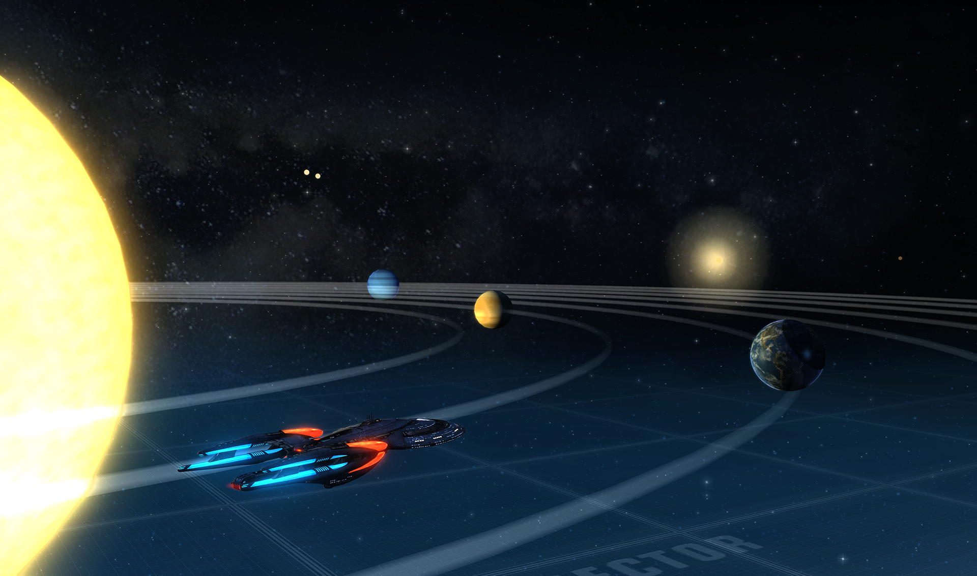
New scale for Planetary Systems
Doffing
We wanted to ensure that player experience with Duty Officers was unchanged. The same areas that granted Duty Officer Assignments before will still grant them in the new map, just without loading screens. The Duty Officer Assignments that are available will change depending on which portion of the map you’re in.
Transwarp
We have changed the way using transwarp to go to missions works. In the live game, if you are on the same map, your ship will set a course to the point it’s supposed to go to. If you’re not on the same map, you will be offered an option to warp to the mission door for a fee. This system would not work very well with our new, very large sector maps, and so we changed it in an effort to keep the same expectation of transwarping if you’re very far away from the mission door, but allowing the option to fly if you’re close to the door.
Transwarp powers have also been modified. All transwarp powers that took you to a sector block will now send you to the central area of where that sector block is in the new maps. This was done to prevent two transwarp powers from sending you to relatively the same location. Transwarp powers that sent you to specific systems or planets remain unchanged.
Tour the Galaxy
Tour of the Galaxy required a change with this complete overhaul of Sector Space. Now, instead of flying into a sector, you will have to fly to a specific planet to complete each exploration task.
We’re aware that this will take longer to do, so to compensate, we’ve increased the time limit in Tour of the Galaxy. Additionally, in the previous version of the mission you only gained a reward for every three sectors you explored. Now, you will be rewarded every time you fly to a planet, with a bonus reward for completing planets in a row or column of sector space. Because of this change, Tour of the Galaxy will give out more rewards.
Foundry
We’ve updated the Foundry to have all doors in Alpha, Beta, and Delta quadrants. I’m sure Foundry Authors will be thinking: “What does this mean for me and my missions?” Our goal is that Foundry users should not have to do major revisions to their missions. If your mission has a door pointing to the old area of Sector Space, the door will be re-directed to the new Sector Space map. For example, a mission directing the player to go to Qo’noS in our old map will direct players to go to Qo’noS in our new map.
Our goal is to make this as painless as possible for Foundry Authors. Missions should work as normal after the update, save for minor text edits Authors will need to make, such as updating directions or removing the words “Sector Block” from text.
Whew, that was a lot to cover. We know there will be a ton of questions still, so join us in the forum thread for this Dev Blog to continue discussing these changes.
We can’t wait to get you guys flying around the Quadrants!
Temba, his arms wide!


I am really looking forward to this addition. For years they have been saying that its just too hard to do, but it seems the time has come. Finally we can traverse space if we want, and those that want to transwarp can do so as well 😉